Ayusanti is a new lifestyle pathway providing a preventative solution for the stresses, trials and tribulations of modern-day living. studiexp_ were commissioned to develop the identity for Ayusanti, positioning the brand as a luxurious and healthy journey towards optimal well-being.
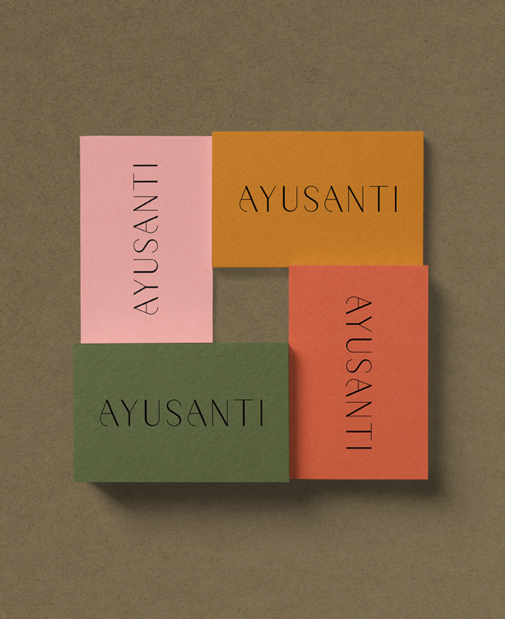
The Ayusanti logotype is an interesting mix of classic foundation and contemporary thinking, referencing Ayusanti’s ancient healing traditions for modern life. Forged from a traditional serif typeface the logotype has been given a modern twist with light and heavy line widths and a stylised letter ‘A’ to convey the welcoming arms of Ayusanti, or a comforting arm around the shoulder.
The Ayusanti seal of approval takes the form of a mobius ring. The mobius ring is an expression of non duality. It reveals the unity of all polarities, creating a state of oneness. It is a spiritually significant symbol of balance and union.
The packaging was designed with the intention of evoking a calming effect on the viewer. This was achieved through balance, in which the visual weight is distributed evenly across the composition. Dreamy abstract patterns were utilised with complimentary colours creating harmony and a strong visual impact when placed alongside each other on the shelf.